I Want My MTV Books History
Quinn Miller / University of Oregon
The empire-building early-cable channel MTV, a marketing engine and brand of “Music Television,” has a press line for custom label book publication dating back to the 1990s. Robin Troy’s 1998 novel Floating represents an important moment at MTV Books, which has a history of holding writing contests. Floating won “the MTV fiction prize,” a competition for writers under 25, to whom the network turned for adaptable concepts. Recruiting manuscripts that might make good programming, they published fiction by authors they characterized as “the young, the hip, and the up-and-coming.”
MTV Books exemplifies music-TV-publishing industry crossover. The imprint’s offerings serve as a record of intellectual-property development. Their list of titles connects to a broader web of MTV-sponsored contests, including many with corporate partners and many tied to or serving as the basis of television series, specials, and feature films.[ (( One such partnership in 2011 coincided to launch Figment, “a community writing site for teens.” ))]
Browsing the releases of the MTV imprint, and the public relations efforts around them that have been preserved, indicates various elements at play in the construction of teen content. It provides case studies and important artifacts related to the emergence of the YA category and shows how “teen” consumption continues to be tailored to cross-platform product integration, such that the work of poet-actor-activist Saul Williams finds a home at MTV Books. Scouting concepts and cultivating talent, and orchestrating proof-of-concept spaces, including for amateurs (with events that double as merchandising and branding spectacles worthy of, or self-generating, publicity), led to The Perks of Being a Wallflower, a bestseller and box office success.
Relatively few actual moving image adaptations emerge from this fast-track research and development trajectory. The arrangement, with its cycles of category reinvention, helps specify the classification technologies (gender, race, sexuality, class) of niche manufacturing, for example in the types of autobiographies by popular performers assumed to have potential appeal, memoirs from musicians, comedians, actors, athletes, and reality TV celebs, as well as an imprint within the imprint for rapper 50 Cent.
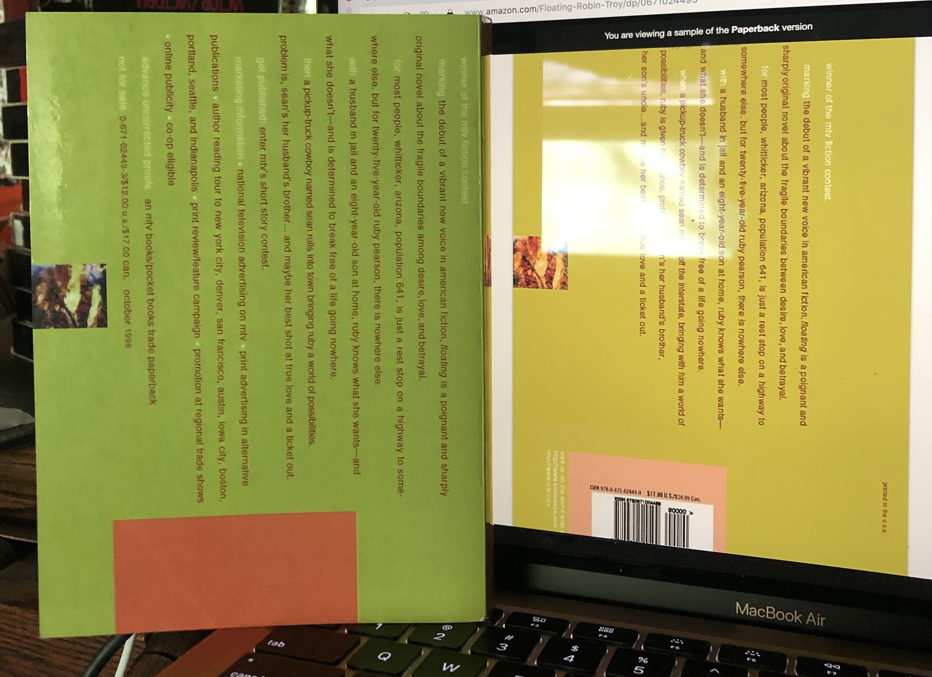
Entertainment supply chain paths newly inflected in the 1990s have become explicit and expanded. The material features of Floating (and the design of the line’s other titles) indicate continuity over the years during which these operations changed and solidified. The book’s aesthetics represent this whole intricate freewheeling world of co-sponsored publicity-branding. Addressing the look of MTV Books can help us understand perceived speeds of cultural production and change, and help us to see intertwined industries shaped by investments in television. The back matter of Floating includes an HIV/AIDS PSA and promotes a pipeline of products in development, including new MTV Books series. Snarky commentary personifying the network in the voice of a knowing pusher or bratty peer frames the list of other titles from the imprint with a transitional announcement doing the work of a TV bumper amping viewers up before an ad break: “Like this is the only one”¦.”
Publicity around a so-called relaunch last year of the MTV Books line, which is now housed under the Branded Publishing Group of Simon & Schuster Children’s Publishing, fostered explicit discussion of industry synergy and A&R, as people such as Valerie Garfield, Vice President and Publisher, described a process of “developing content that can work across multiple forms of media.”[ (( Greg Evans, “Macmillan Editor Christian Trimmer Tapped To Head Relaunch of MTV Books.” Deadline January 12, 2021. https://deadline.com/2021/01/christian-trimmer-mtv-books-head-relaunch-simon-schuster-1234671878/. ))] Nina L. Diaz, at the time President of Content and Chief Creative Officer at MTV Entertainment, ViacomCBS’s MTV Entertainment Group, described their efforts “to uncover new, cutting-edge voices and fast track their stories into series and TV movies.”[ (( Ibid. ))] A 2012 Tumblr-based writing contest for MTV’s Teen Wolf, a morphing of the 1998 MTV prize competition, solicited fan fiction. This reboot had an “official tumblr” titled “never love a wild thing” that supplied real-time content for fan participation according to ad cycles, as part of an integrated publicity machine. It used the all-lower-case aesthetic of the cover design for Troy’s 1998 winner Floating. In that case, Troy had won a contest of over 500 entries. The Teen Wolf tumblr reported receiving 10,000 entries within the first ten days.
My connection to Floating is a queer one, to the cover design. Floating is super cute and looks like candy, or confectionary-inspired home decor. My copy is an advanced uncorrected proof of the trade paperback published in October of 1998. An advanced copy of anything, books, music, or movies, was apparently appealing to me long before I began actively studying blurbs as a highly charged multi-media system of hierarchy and irony. At the time, the inevitable riffing on the ubiquitous phrase “I want my MTV” included a blurb in Floating‘s front matter (“I want my MTV””and another book by Robin Troy!” penned by Suzanne Strempek Shea) and a Publisher’s Weekly article by Judy Quinn (with the headline “I Want My MTV””Novel?”).[ (( December 15, 1997, 19-20. ))]
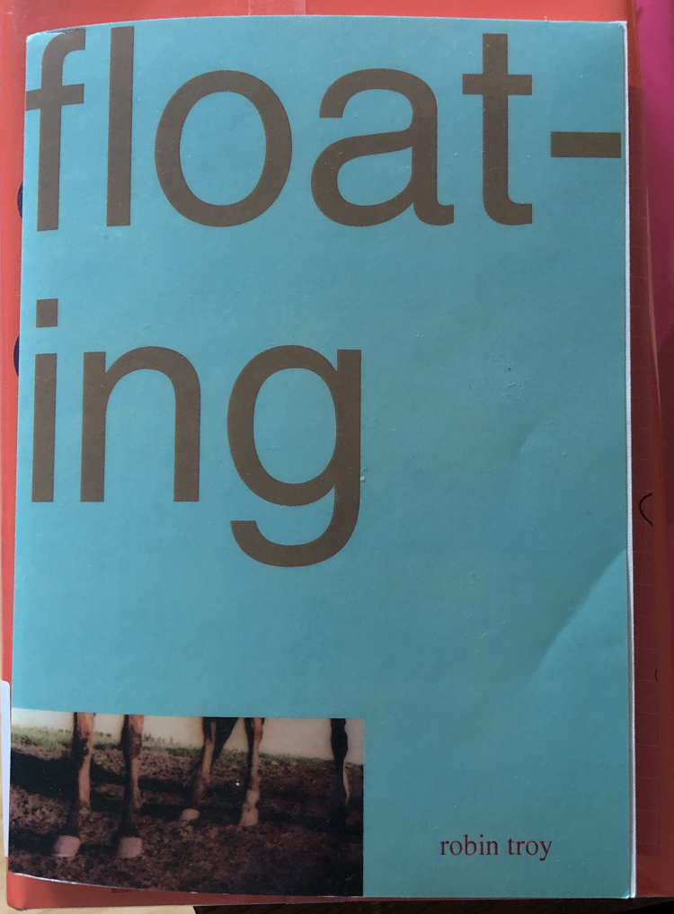
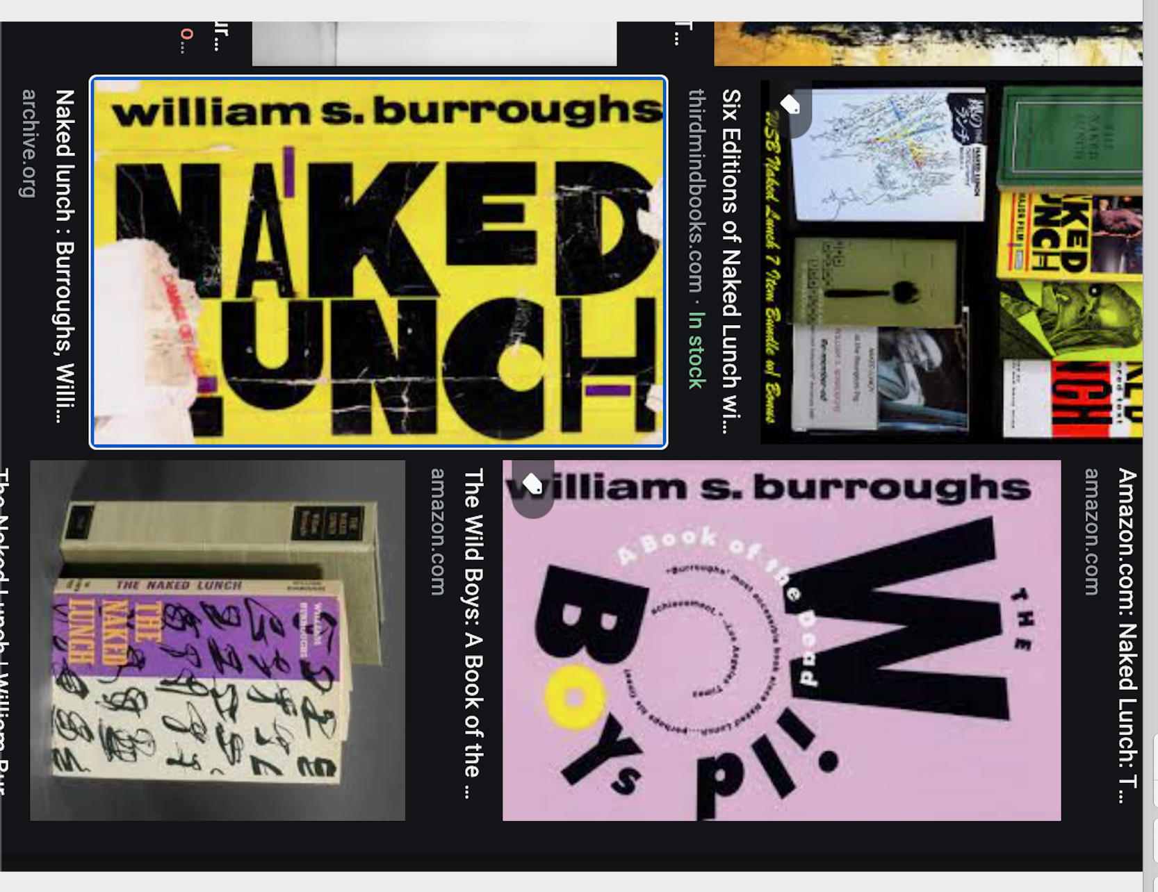
The look of Floating, rendered
float-
ing
or
float-
ing
evokes a distinct period and sensibility characterized by playful font work and the use of bold or pastel or otherwise unique colors, including in combinations commonly understood to clash. Floating resembles and shares a sensibility with the Grove Press edition of William Burroughs’s Naked Lunch from 1992 and also with the 1994 Grove printings of Burroughs’s Nova Trilogy (The Soft Machine, Nova Express, and The Ticket That Exploded), with their off-grid arrangement of cover text vectors and font work conjuring movement. The colors and style of formal experimentation construct a recognizable queerness, an accessible queerness, through their individual color schemes and a common play with color conjunctions. The tones and the askew factors signal unconventional content and approach. The Wild Boys has a blurb in a spiral, and on The Soft Machine there’s a blurb in the shape of an “S.” On all four, Burroughs’s name, positioned vertically at left, makes an additional spine of sorts, one supported by the graphic cubism.
Floating cues engagement through the genderqueer qualities of its aesthetic juxtaposing gemtone hues. Floating seems femme. Unconventionally so, with its peach-pink spine, a chartreusey lime back, and an aqua front cover reminiscent of the pale teal backdrop dotted with pink and purple on the distinctive cover of the 1993 anthology Fear of a Queer Planet. The colors selected for the cover of Floating bleed a bit onto the spine, creating a rounding aesthetic that rounds out the corners of the binding and emphasizes its palpably acrylic plastic coating. There is a queer tweaking of the already queer color combinations marking fashion trends in the field of aerobics and elsewhere.
The book prominently advertises its brand, both through the overall aesthetic and in terms of the distinctive MTV logo. The insignia on the spine, along with the trademark Pocket Books kangaroo, is in a bronze hue that plays off of the gold-red taupe of the lettering of the title, spinning it into a mauve-brown in proximity to both pink and blue.
This book brings back memories for me by way of Naked Lunch, which my high school English teacher deemed unsuitable for a group book report project””after I excitedly tracked it down at the local Barnes & Noble, where I delighted in its horizontal rotation device. Back then the book represented my queer interests, to myself and others. That was fun, and meaningful, and these cover designs encapsulate it.
Image Credits:
- On the back cover of Floating, words are positioned horizontally rather than vertically. (author’s personal collection)
- MTV Books logos. (author’s screengrabs)
- Floating‘s prominent font, oversized to take up half the cover, accentuates a hyphen linking the text of the syllables “float” and “ing.” Front and back eschew capital letters, in a twee gesture to alternatives. (author’s personal collection)
- The 1992 edition of Naked Lunch features a “landscape” arrangement of text across its front and back covers, rotated counterclockwise ninety degrees relative to the standard “portrait” orientation of the interior text. (author’s screengrab)