Data Visualization, Loops, and the Taming of Big Data: Wind Map
Tess Takahashi / Independent Scholar
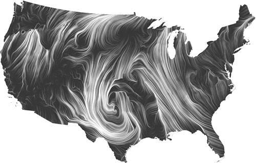
On initial viewing, Fernanda Viégas and Martin Wattenberg’s Wind Map seems to be a real-time data visualization of wind patterns across the United States, appearing to “let the data speak” in a way that feels direct and immediate. However, despite the seamlessness of its animation, closer inspection reveals that Wind Map is an animated loop, rather than a direct and seamless feed, whose data (taken from the US National Weather Service) is updated once per hour and accurate within a 2-mile radius. While Wind Map seems to produce a real-time indexical correlate of an otherwise invisible force, the wind, a closer look reveals its delays, approximations, and repetitions of official data. But what does it mean for a loop to masquerade as real time? In the case of Wind Map, this seemingly minor deception suggests that the world is fully available to us – without gap or absence.
Wind Map was recently on display at the Museum of Modern Art in New York City in a show on design and technology, but it also has been featured as an exemplary text in a wide variety of blogs and articles between 2012 and 2013, many of which examined the phenomenon of “Big Data” and the increasing importance of data visualization within the larger culture. In 2012, New York Times journalist Steve Lohr called Big Data “the rising flood of digital data from many sources, including the Web, biological and industrial sensors, video, e-mail and social network communications.” Many cultural critics have discussed Big Data in relation to widespread anxiety about there being, in the words of historian Ann Blair, “too much to know” in a context where, as Viktor Mayer-Schönberger and Kenneth Cukier say, “stored information grows four times faster than the world economy, while the processing power of computers grows nine times faster.” In this context, there has been a fundamental epistemological shift in the ways in which we figure and navigate data, a realm now defined by its magnitude. Under these conditions, the magnitude of Big Data can produce anxiety over its condition of being not only “too much to know,” but too big to see.
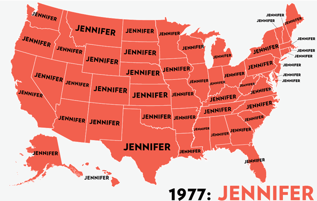
Looping data visualizations like Wind Map can seem like an antidote to the problem that Big Data, which, like the larger system of the wind, is “too big to see.” Data visualizations like “The Most Popular Names of Boys and Girls Over Six Decades” pop up repeatedly on our feeds, squeezing decades of information into seconds. While many data visualizations are static, they frequently take the form of the looping gif, the web’s more common articulation of punctuated emotion: “Can you even?” “So wow.” However, looping data visualizations like Wind Map are quite different in their function from bite-sized gifs of eye-rolling dogs and celebrities. Rather than playing to fleeting emotion, they reveal a common state of cultural ambivalence about what we can know today.
As you can see from the handful of images here, data visualizations are easy to grasp in a single glance. They combine the aesthetic, the educational, and the entertaining in the attempt to access and tame data about invisible forces in ways that make it both more concrete (in the sense that it becomes comprehensible) and more abstract (in the sense that it simplifies, condenses, and brackets its representation from context, history, politics, and concrete material effects). In its aesthetic choices, Wind Map, for one, has a clear modernist appeal, with its color (or rather absence of color), the simplified shape of its map (which shows only the outline of the continental United States without lines demarcating individual states or geographical characteristics), and the width and length of the simple flowing white lines that depict the movement, force and speed of the wind.
Despite its abstract qualities, Viégas and Wattenberg describe Wind Map as a “living portrait” of the wind. If we take this description seriously and read Wind Map as a kind of portrait, we see that it focuses on the “head” of the United States and eliminates seemingly less important geographical appendages – Hawaii, Alaska, Puerto Rico, and Guam – as well as the countries of Canada to its north and Mexico to its south. Wind Map’s geographical absences surround a floating, decontextualized map of the U.S. that suggests the wind begins and ends at its borders, leaving it hermetically sealed from not only the airspace, but also the politics, of the rest of the world.
Granted, most looping data visualizations present information over the form of the simplified map as a way of managing scale and complexity, whether temporal, spatial, or political. The aesthetics of these maps and the information they depict varies widely. Within them, the animated loop is used to trace various forms of movement: the movement of bodies, borders, eyes, markers, machines, and natural resources – alternately produced as abstracted lines of boundary, lines of force, dots, and sometimes written language. Their stories, politics, and context are also radically stripped and rhetorically simplified.
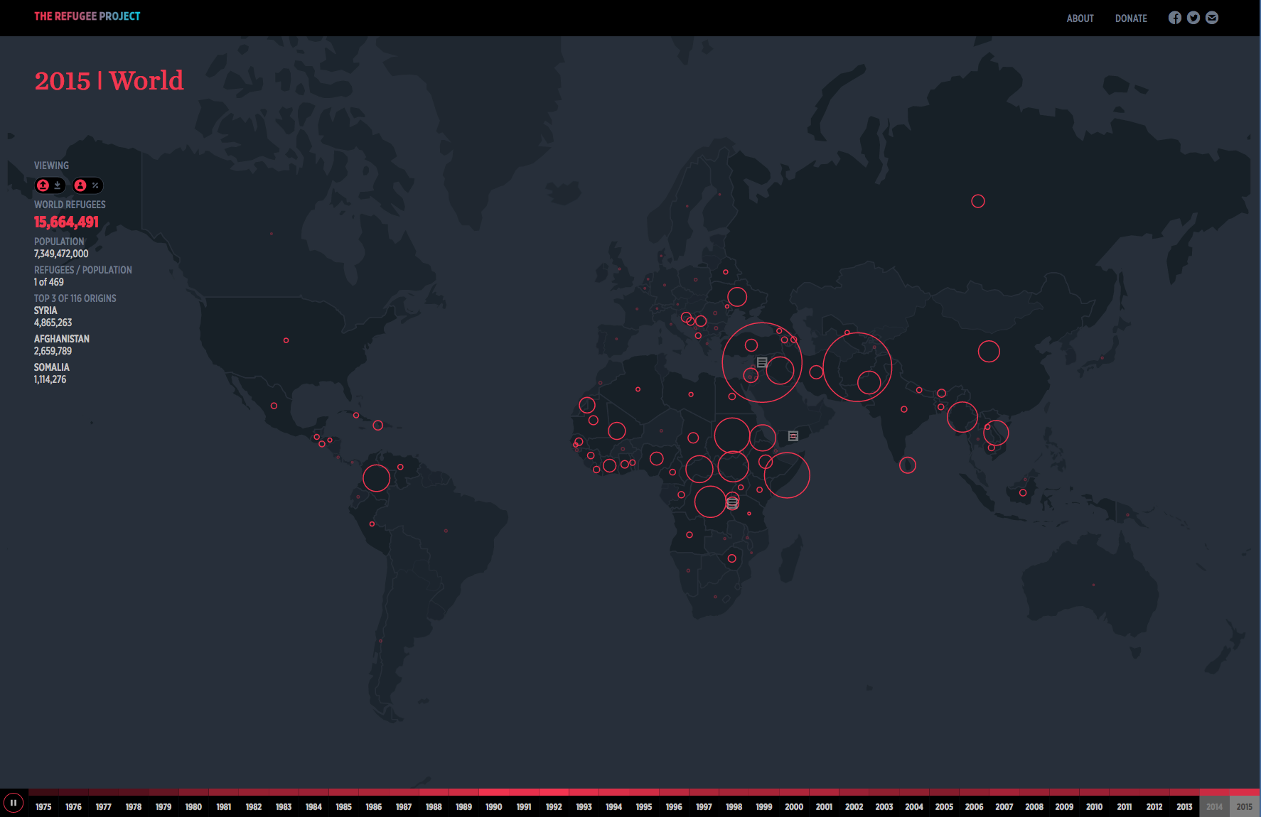
At one end of the spectrum of immediacy and significance, YouTube produces real-time visualizations of its most popular videos by region over the continental U.S. At the other end, The Refugee Project charts the world migration of refugees over a forty-year period over a flattened map of the world. Whether operating as a passing entertainment or an activist intervention, many data visualizations organize historical time succinctly, condensing it into periods ranging from several seconds to several minutes. This choice certainly fits the short-attention span of the typical on-line viewer, whose gaze is solicited by flashing ads, often themselves gifs. Buy this! No, this! One might also argue that the attention span of the mobile gallery-goer is not much longer, surrounded as he or she is by competing visual demands. Look at this! No, this!
Such demands point to the underlying epistemological stakes of data visualization under what Jonathan Beller and others have described as the current “attention economy.” On the one hand, data visualizations can anchor us. They locate us not only in physical space, but also within an amorphous sea of digital information by giving us the impression that we are seeing the big picture. In this way, they seem to provide a ground of certainty that makes otherwise unmotivated, unrelated, random events meaningful. On the other hand, gifs like Wind Map might also make us aware, if only dimly, of the impossibility of ever fully grasping the complexity of historical time, the vastness of geographical space, or the bigness of Big Data.
What ultimately deters us from dwelling on that uncertainty, however, is the delight such visualizations produce. It’s an epistemological delight – a delight in knowing – or thinking we know – and it’s based on the feeling of mastery over the unexpected and absurd forms of information that today pass as “knowledge.” We experience Wind Map, The Refugee Project, “Most Popular Girl’s Names,” and “Most Popular YouTube Videos” as radically equivalent. These pleasurable, abstracted, endlessly circulating, and easily discardable bites of knowledge tend to pass through us with little consequence. Like the microscope and telescope before it, data visualizations seem to allow us to see what was previously invisible to us – even as they produce new blind spots.
*This article originated as a paper presented at “Codes and Modes: The Character of Documentary Culture,” a conference held at Hunter College, City University of New York, November 7-9, 2014.
Image Credits:
1. Wind Map
2. Jennifer
3. Refugee Project